In past years, MLB.com has been using old baseball card designs for each player profile, whether it was real or a very close facsimile. And this year, the 1977 Topps baseball design is being featured. But before we show this year's effort, let's look back to past designs used by the site for their fantasy profiles.

This was last year's (2012) player profile pilfered from MLB.com's fantasy review. It looks like the 1986 Topps Baseball was featured except 1986 Topps used circles for the player's position, not square ones as in the above example. But comments by readers of last year's post indicated that it just may depend on the browser used because some saw circles while others (like me) saw squares.

This was what the player profiles looked like in 2011. The pictures used were an homage to 1983 Topps Baseball...except 1983 Topps used round frames for the headshot on the corner, not square ones as in the above example.

This is from 2010. MLB.com used the 1987 design for the fantasy preview.

The great 1984 Topps design was used in 2009.

The 2008 preview featured the 1980 Topps design.

And so did the preview from 2007. But notice how the cards are "aged?" The bent corners and the weather worn borders?

For 2006, it's the 1985 design. The actual pictures were not appearing when I was first digging around for the site. It showed the design, but no picture (guess you should use your imagination). Upon hitting the link this year, it hasn't changed.

And here is the preview snapshot for 2005. They brought us all the way back to 1976 with this one. What's cool is that when you click on the position, the drawing of the player on the bottom left of the card appears above the position list.
So now ladies and gentlemen the 2013 player card used for MLB.com's fantasy preview:
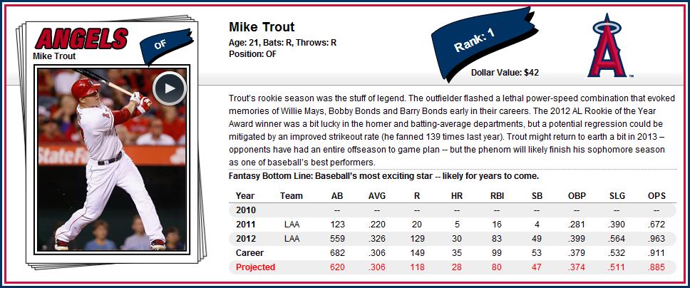
Let's compare the Mike Trout card used above to an actual 1977 Topps card:

As you can see from the example, the letters on the team name, although thinner than on the actual card, utilize a similar font. The pennant that holds the player position seems to be the focal point of the profile card as Topps uses it for the player ranking (Trout being #1, Bobby Jenks is #845, the last person listed). Obviously, there is no facsimile signature on the profile card.
I said it before, and I'll say it again. Baseball cards were the fantasy preview magazines BEFORE there were such things. The cards had stats, a brief bio, a clear picture of the player (in many cases anyway), and it was all contained in a portable 2½" x 3½" piece of cardboard. Of course, thanks to magazines and the Internet, the cards are no longer used as a primary resource. But they're still around, and thanks to MLB.com, baseball cards still serve a purpose.
Sincerely,
JayBee Anama
1 comment:
This is uncanny. Earlier today, I was wondering about MLB's fantasy site and when it would go live. And *poof* here it is.
Awesome job reading my mind!
Post a Comment