Here you go:


There were also parallel images, unique to the flagship:
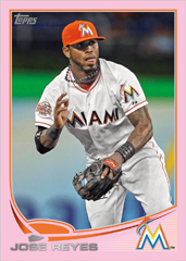
Pink:
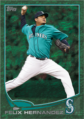
Camoflauge???:
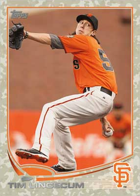
Green/Emerald???:
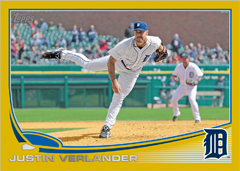
Looks like gold is back:
Initial thoughts? I can see the baseball diamond design, but with the curves and all, the ball field looks more like a ship from Star Trek (curved foul lines look more like spacecraft wings). The name font looks similar to 2010 Topps. I think what makes this stand out for me is that the logo is large and proudly displayed on the right corner of the card.
This isn't an earth-shattering design (see what I did there...) but it doesn't disappoint either. I can't wait to see what the sell sheets look like to get more details on what is yet to come.
Are you excited yet???
Sincerely,
JayBee Anama
4 comments:
One of the better designs, clean un cluttered photos! Maybe the learned to proof read the stats area for the 2013 release!
I expected as much, but like last year when Topps didn't go with the wood border every 25 years thing, they're going away from and even more common them they've had in the years ending in 3. Think about it - ever year but 1993 had either a logo or player photo in the bottom corner.
1999 did not have a logo.
I love anything that's not full-bleed.
Post a Comment