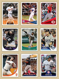
This is just a preview. There are more of these where they came from. And I will explain where they came from soon.
Sincerely,
JayBee Anama
Another in a long line of blogs devoted to baseball cards, specifically from the Topps Company, and the Hobby in general. Reviews on new and older sets, along with unbiased opinions, will be included.
If you stumbled upon this blog and didn't find what you were looking for, please feel free to e-mail me at bdj610@hotmail.com. I'd be happy to answer your questions.
I love comments. Please leave comments!!! (Ego, hush). Just keep your words clean (I show my kids this stuff), and the comment will be accepted.
If you must leave a comment anonymously, that's fine too. Although I wish you wouldn't. I'd like to get to know the people who actually read this humble little blog.
Thank you very much.
Sincerely,
JayBee Anama
I like the 6th one the best...although most of these are an improvement over 2012 Topps.
ReplyDeleteI still think they should have used the 2011 Stickers design for 2012 Topps. Would've looked SO much better!
ReplyDeleteYes, the Longoria card looks the sharpest.
ReplyDeleteI don't care for the Markakis, Votto, Jimenez, or Lincecum, and Cano looks too much like an Upper Deck product. The Longoria and Youkilis are my favorites. I still say 2012 Topps has a nice design, it just would look better with wood grain (or at least non-white) borders. Most of those might too, actually.
ReplyDeleteI like the King Felix card the best. As far as I can tell I don't remember seeing anything like it in the past.
ReplyDeleteI don't like how the Longo card has a droopy feel to the left bottom side.
The Logoria and Youk designs are the best of the bunch, imo. I'd be very happy if either was a real Topps design. None of the three in the top row should ever see the light of day, at least from Topps. The others are just blah, but I wouldn't jump off a bridge if they were Topps cards.
ReplyDeleteOh, and for the record, I really enjoy the actualy 2012 Topps design.